Improved performance
An online software like projectfacts offers many advantages, because it is always and everywhere accessible where there is internet. Nevertheless, sometimes you also want the comfort that a conventional application on the PC or smartphone offers.
As a progressive web app, projectfacts offers you exactly these advantages. Simply place the software on your dashboard as a desktop or home icon and get started immediately.
In the new version, projectfacts starts and works even faster and more fluidly. In addition to the speed increase, projectfacts also offers you many other useful features and improvements.
projectfacts as a Progressive Web App
From now on you can also use projectfacts as a Progressive Web App (PWA). A PWA starts particularly quickly and is also available offline.
You can enjoy further advantages if you install projectfacts on your user interface. The app then starts even faster, as there is no need to log in. You also benefit from an optimised display on mobile devices, because projectfacts is called up as an independent web app and not within the browser window.
If you install projectfacts as a PWA on the desktop, notifications are signalled directly in the taskbar. This way, users are always up to date and can take care of tickets etc. in a timely manner.
You can find installation instructions and further information in this article on projectfacts as a PWA.
Multi window operation
From now on projectfacts can be operated in several windows or browser tabs in parallel. Hold down “Ctrl” while clicking on an element in projectfacts. Then the desired element opens in a second tab or window. Especially for users who work with several screens, the multi-window operation offers clear advantages and ensures that you can work even more comfortably and efficiently with projectfacts.
Optimised mobile display
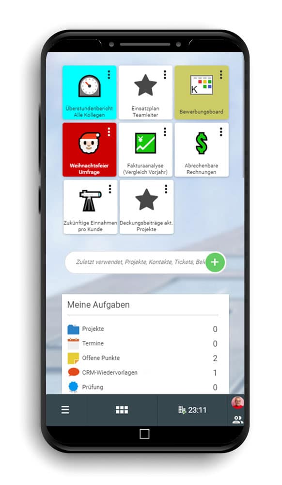
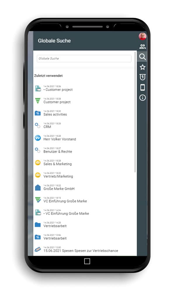
If you use projectfacts in mobile form, i.e. on a smartphone or tablet, you can look forward to a new optimised display. All control elements have been improved for use on devices with a small screen.
- Tiles are arranged vertically on the smartphone and are thus easy to find and select by scrolling.
- Modules open in a separate context menu that appears on the side of the screen. Simply select the desired menu item and jump directly there.
- You access the sidebar by tapping on your profile picture at the bottom right. From there, you can open the colleague overview, recently used items, etc. as usual.
- Lists and filters automatically adapt to the size of the screen. If not all columns fit on the screen, you can move intuitively through the list by swiping.
- The left-hand area, which shows you preview cards and actions, can be folded in and out at any time, depending on what you want to work with at the moment.
Header image: © Robin Spielmann – unsplash.com


